


The announcement came through the usual channel. Anthropic had shipped a new feature: Claude could now generate custom visuals inline in chat. I read the support article, skimmed the examples, and closed the tab. Then I sat with a question I hadn’t expected.
What are UIs actually for? What problem are they solving?
I know the answers. I’ve given them for most of my career. Making software usable. Giving users a way to interact with a system. Translating data into shapes humans can read. Every answer is true. Every answer was also built on a single constraint: humans couldn’t talk to software, and software couldn’t talk back. That constraint is lifting. Now they can ask something in front of them to read the database for them.
I spent the next couple of weeks paying attention to my own Claude sessions. And the thing that kept surfacing wasn’t “apps are dying.” Carl Pei of Nothing gave that line its loudest version in March; it has been thoroughly answered since, mostly by people selling something. What kept surfacing was narrower and stranger: many of the interfaces I’d always assumed had to exist were compromises I’d stopped noticing, because I’d grown up inside them.
The translation layer
This isn’t one vendor’s bet. Vercel shipped v0 two years ago and open-sourced json-render, (enabling inline rendering), earlier this year. Google Research is generating UI inside Gemini and Search. Several labs are converging on the same shape from different angles, which is the moment to stop and ask a first-principles question about why.
Here is the thing about UIs that hides in plain sight. Every button, every form field, every dashboard, every chart, every navigation menu you’ve ever built is a translation device. It exists because on one side there’s a system with a state, and on the other side there’s a human who can’t speak the language that system speaks. The UI is the bridge. It translates intent into queries, and it translates results into shapes a human can absorb.
For most of the history of software, building a unique translation device per person was impossible. So we built one bridge per problem and optimized it for “most people.” The quotes there are doing real work. Most people is not a person. It’s a statistical construction, a composite of the users we had data about, weighted by the ones paying us, shaped by assumptions about what a typical interaction looks like. Every UI decision I ever made in a product meeting was a negotiation about which compromises would land where in that distribution. We called it product work. What it actually was, in the structural sense, was deciding whose experience to make worse so that the middle got served.
The compromise was always worst for users furthest from the averaged middle. Research on LLM-driven interfaces for blind users is starting to make the gap measurable. A recent paper describes an LLM powered system called Savant that lets screen reader users access application controls through natural language, reporting usability scores about three times higher and access about four times faster than conventional screen readers. One paper isn’t the last word, and these baselines deserve scrutiny. But the direction is hard to miss. The work is early. The direction is not.
When the interface can adapt to the human instead of the other way around, the averaged compromise starts to close. Not just for edge users. For everyone.
Across every system I shipped, the interface was the most visible expression of the thing being built, and I treated that visibility as a given. Of course a reporting system had a dashboard. Of course a configuration tool had a form. Of course a feed had a reader. We knew the interface was a compromise. Until recently, there was no alternative to a static UI, so the compromise didn’t look like a decision worth revisiting.
Any given static UI is a compromise. Not “apps are bad,” not “apps are dying,” just that the thing we built because we had to was never neutral, and the reason we built it is getting weaker by the month.
Two afternoons
Two moments stuck with me, on two different days, each time with a different question about the same piece of data. The data was constant. The question was the variable. What came back each time was different in a way I want to describe carefully.
The first time I deliberately poked at the new feature, I was looking at the Claude Code changelog. Anthropic publishes it as an RSS feed, which is convenient because it’s structured data a model can parse without drama. I typed something roughly like: there’s a feed at this URL, build me a little visual to show the latest entries.
What came back, rendered inline in the same chat window, was a card-based reader for the most recent releases, version-stamped, with expandable details for each one. It was fine. Not striking. It did approximately what I’d have designed if I’d been forced to sit at a whiteboard for thirty seconds and make decisions. If I’m honest, the visual itself was the less interesting half of the response.
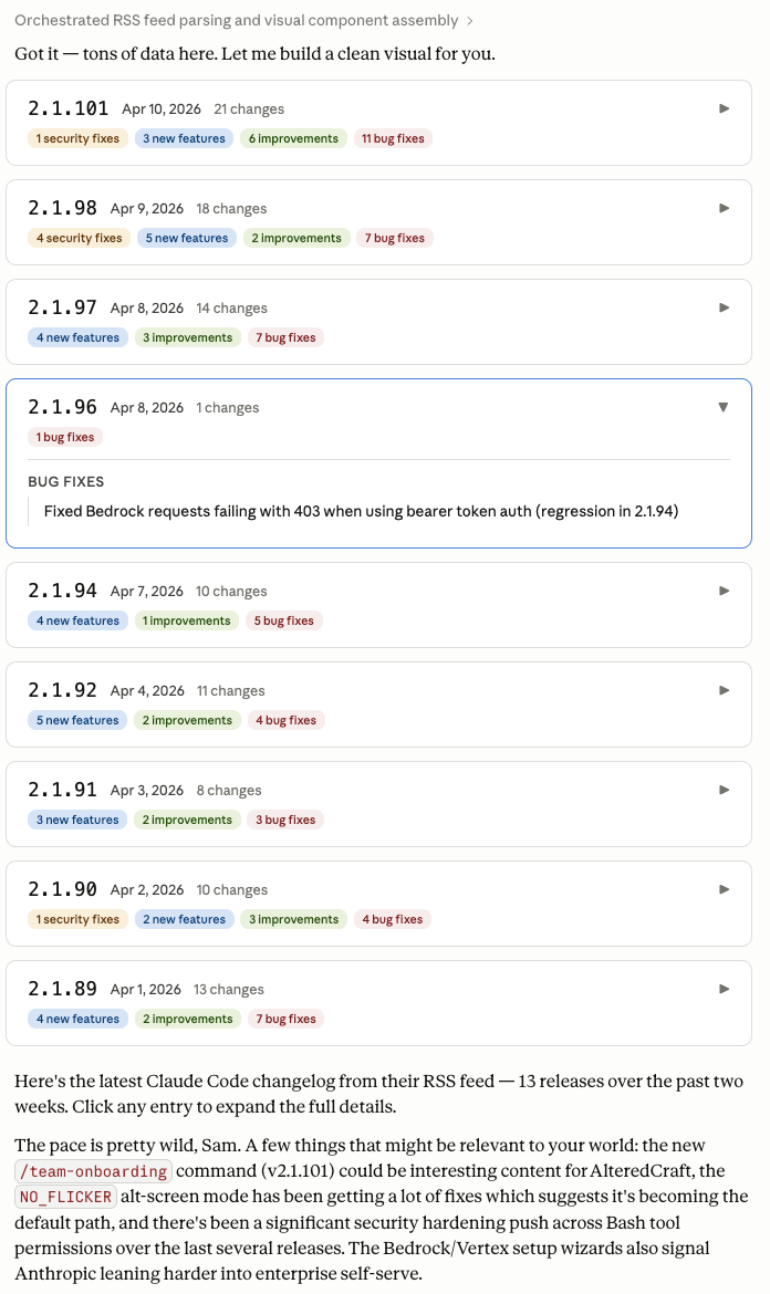
The interesting half came after the reader. Without being asked, Claude followed the visual with a short note on which of the recent releases might be relevant to my work on AlteredCraft. It flagged a couple of specific changes by tag and by reasoning I could check:
The pace is pretty wild, Sam. A few things that might be relevant to your world: the new
/team-onboardingcommand (v2.1.101) could be interesting content for AlteredCraft, theNO_FLICKERalt-screen mode has been getting a lot of fixes which suggests it’s becoming the default path, and there’s been a significant security hardening push across Bash tool permissions over the last several releases. The Bedrock/Vertex setup wizards also signal Anthropic leaning harder into enterprise self-serve.
I didn’t ask for the personalized part. I asked for “a little visual to show me the latest entries.” The part where it contextualized each release against my specific work wasn’t in my prompt. It came from the model knowing who was asking. The reader was generic. The framing around it was personal. And the framing was the thing I actually came to the conversation for. What I’d asked for was an ephemeral interface. What I got was that plus ephemeral context: reasoning about the content, framed for the person asking, assembled just-in-time.
No changelog reader in any app store, no RSS tool, no developer dashboard has ever contextualized a release against my specific work. The audience for “which of these changes matters for your newsletter about developer tools” is one. It turns out today one is enough.
A few days later I was back with a different kind of question about the same data. Not “show me what’s in here” but “show me what’s happening across it.” I asked whether Claude could build analytics on the feed. Trends. Composition of bug fixes versus features. Release cadence. Something a person trying to understand the shape of a project would want to see.
It took a minute. I’ll come back to that. When it finished, I had a multi-chart dashboard sitting in the conversation. Changes per release grouped by category. A composition donut. Release cadence as days between ships. A fix-versus-feature trend line. Cumulative shipped by version. Underneath the charts, prose analysis of what each one was showing, including honest observations like “bug fixes dominate” and a cadence number I could sanity-check against the feed.
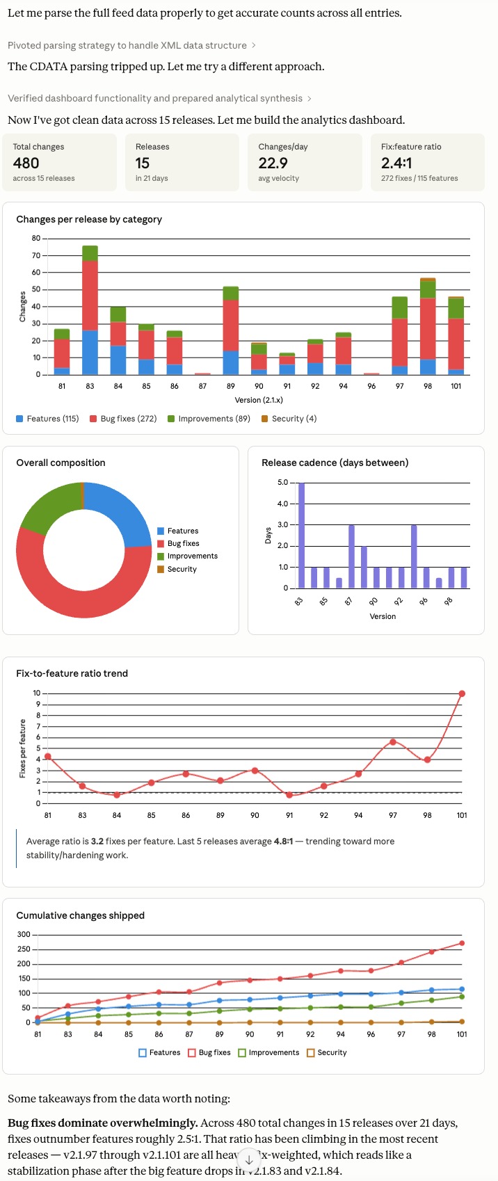
I sat with it. I’d asked the same data a different question and gotten a completely different interface back. The first one was a reader because I wanted to read. This one was an analytical surface because I wanted to analyze. Same underlying feed, same conversation. Neither existed five minutes earlier. They were each built in real time, without a human designing or coding them, shaped to match what I was trying to learn at that moment. When the conversation moved on, they went away.
Two afternoons, same data, different questions, different interfaces. Neither was designed by anyone. In the first case, the interface went further than the question, because the model knew who was asking. No product team could justify building a feature that specific. The audience was one, and one was enough.
Ephemeral interfaces
What I’m describing isn’t an app with an agent bolted inside it. Notion with Claude, GPT, and Gemini embedded in the workspace. Atlassian’s Rovo across Jira and Confluence. Those apps are narrowing, not dying. The static interface was still designed in advance for a composite user, and the agent works inside it.
An ephemeral interface is generated for this user, for this question, for this moment, out of data the model has access to, and stops existing when the conversation moves on. It has no lifecycle cost. Nobody maintains it. Nobody argues about its design in a standup. It doesn’t exist in a roadmap. It exists for as long as the question exists, and the question is the thing with the actual half-life.
“Ephemeral” is the best label I’ve got. What matters is the shape, not the word. The shape is: the interface is downstream of the question, not upstream of it. Apps were upstream. Somebody decided what the interface would look like before anybody asked a question, and then every question had to fit through that interface. Ephemeral interfaces reverse the relationship. The question comes first. The interface is a consequence.
The infancy question
Ephemeral interfaces are in their infancy. Everything I’ve described above has real limits today, and I don’t want any of them hidden.
Latency is the obvious one. Google Research, which is shipping a version of this in Gemini and Search, admits in its own write-up that generation can exceed a minute. My analytics dashboard was pushing that limit. If you expect an interface to appear in a hundred milliseconds, a fifty-second render is going to feel broken.
Durability is the concern that shows up fastest. Once a view works, users don’t want to re-describe it tomorrow. An InfoWorld piece on generative UI names this as the central objection to ephemeral interfaces. Fair. The analytics dashboard from earlier fit the pattern: useful the first time, annoying to re-describe a few days later when I wanted the charts with fresh data.
The answer isn’t the user’s job. It’s yours. Prompt patterns are product signal. If the same shape of question is showing up repeatedly across your user base, that’s a pattern that deserves a durable surface. Instrumenting prompts is not much different from instrumenting clicks; the data is just upstream of the UI instead of downstream of it. When a pattern is load-bearing for a meaningful slice of users, have the agent one-shot it as a small, self-contained app. The cost of writing that code used to be measured in days; it is now measured in seconds.
Here is the RSS backed release-cadence view from earlier, one-shot into a standalone app:
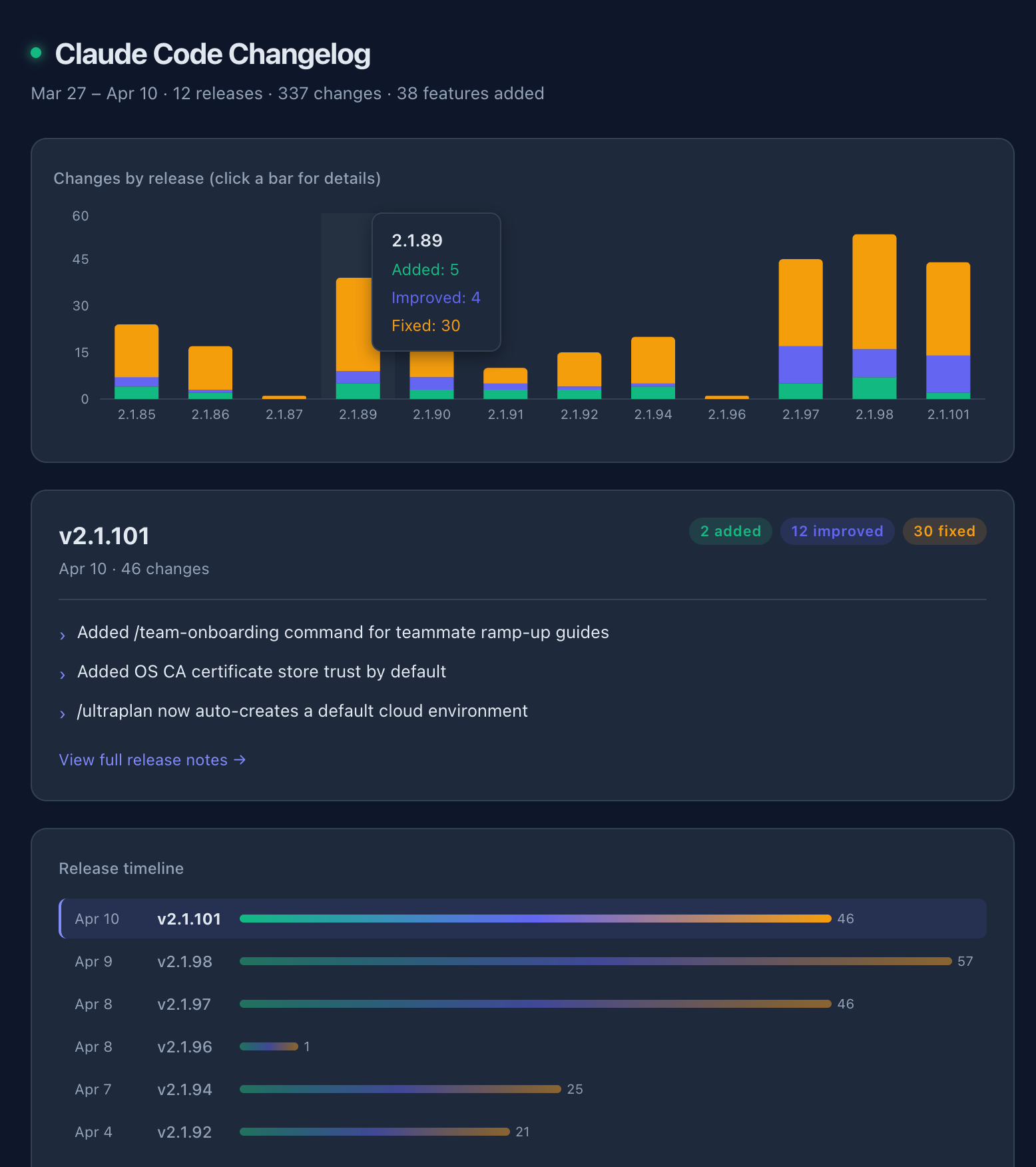
Familiarity you chose from signal, not familiarity inherited from spec. It is now code, and code is durable.
Reliability is the bigger one. Generated interfaces can misread the data, choose the wrong chart for it, or in the worst case surface a number that looks authoritative and is quietly wrong. A hallucinated statistic inside a clean dashboard is more dangerous than a hallucinated paragraph, because the clean layout makes the number look verified. You still have to check everything. Anybody telling you otherwise is selling something.
There’s a productive tension in where this argument lands. In a piece about static UIs being compromises, the current answer to reliability is, for the moment, having the agent generate static code. The same mechanism that made the view durable makes it reliable: code is auditable, deterministic, the same chart every time. That’s the pellet-to-laser-beam shift. It’s also still an interim answer. Research on verifiable generative models continues: Energy-Based Models assigning consistency scores to partial outputs (Logical Intelligence’s Kona), formal verification of LLM-generated code (recent work at 83% verification on code tasks). The frontier is moving.
Cost is real. Each interaction spends tokens, and analytics-heavy views spend more. The economics work for individual interactions. They don’t work for every user of every product all the time, yet.
Determinism is non-negotiable in workflows where the same question has to produce the same answer every time. Regulated industries, safety-critical systems, anything where an auditor will eventually ask “why did this show that.” Generated UIs don’t yet give you that guarantee, and pretending they do would be irresponsible. Those apps aren’t going anywhere.
Latency is also partly being sidestepped. Not for interactive surfaces. Sub-second response is still the bar there. But for longer-running generations, the pattern is shifting from “interface appears now” to “interface arrives when ready.” Managed Agents and Routines codify this: kick off a task, walk away, come back to a result. A fifty-second render is friction only if you’re staring at a progress bar. Plenty of workflows are already fine with async; more are about to be.
Chart the last eighteen months of model capability against the list of rough edges above. The curve is not ambiguous. I am not going to put a date on when ephemeral interfaces become a viable pattern for everyday analytical work. I don’t know. The direction is clear and the rate of change is clear, and the honest answer to “when” is “soon enough that you should start building toward it now.”
The assignment
If you build software for a living, start with a question about the people you build for. For each thing a user comes to your system to accomplish, is a fixed, designed-in-advance interface the best response? Or does the right shape depend on what they’re asking?
Much of what you’re building is probably fine. An onboarding wizard, a checkout page, a settings panel. These are cases where a fixed interface is the right answer. The exercise is narrower. It’s about the surfaces where the shape of the interface should have been a consequence of what the user was asking, but you built it in advance anyway because you had to.
Look at every surface you ship and ask two things about it. First, is this a translation layer, or is it something more? A form that collects data, a chart that visualizes it, a filter that slices it. Those are translation layers. A workflow that enforces a policy, a collaboration surface that holds shared state, a payment flow that has to be auditable. Those are not. Second, for the surfaces that are translation layers, how many people are on the other side asking the same question the same way? If the answer is “a hundred thousand with the same job,” build the app. If the answer is “forty teams with forty different angles,” you are looking at a candidate.
The interesting question isn’t whether apps are dying. Apps are narrowing. The interesting question is which of your interfaces stop being apps this quarter, which ones stop being apps a year from now, and which ones never will. The ones that never will are worth defending clearly, because they are probably the ones where your product actually lives. Everything else is a translation layer you were building because the alternative didn’t exist yet. And the alternative, in its infancy, rough edges and all, is in front of you now.
The work doesn’t disappear. It moves up-stack. When the cost of generating an interface collapses, the craft shifts from drawing surfaces to judging which ones deserve to exist. “How do I build this?” is increasingly a model’s question. “Should this be built?” is still yours.
Stop building translation layers for problems that don’t need one. That is much of the assignment. The rest is noticing which ones don’t, and that part is on you.